In what way does your media product use, develop, or challenge forms and conventions or real media products?
When we decided to create a trailer for a horror film, we researched different sub-genres in that genre, including slasher, vampire/werewolf/monster and supernatural/thrillers. In each sub-genre, we looked at the codes and conventions before narrowing the choice down and choosing to make our trailer a slasher horror. Our research in this sub-genre gave us ideas of what technical and symbolic codes we should try and implement into our trailer.
In our trailer, we used jerky camera movements on a handheld camera several times, to show the killers point of view. The handheld killer point of view is very common in slasher films as it shows us part of the killers personality, as he is unstable, like the camera, also the jerky handheld style is very voyeuristic, which worked very well as our story is about obsession and stalking. We used the sharp/rapid cuts to make the trailer move quickly and also to create suspense. We cut out at certain points, especially when the killer was involved, so his identity was kept secret in the trailer and his identity would still be a mystery to the audience when they went to see the film itself. We used extreme close ups in the trailer, when showing the weapons and injuries/restraints on characters, this made the trailer easier to define as a horror as in our research of other similar products, we noted that these elements of obvious horror such as a fearful look, a scream or bound hands are greatly exaggerated in order to instil fear in the audience; they can’t deny they are expected to feel fear when the entire screen is filled with these fearful images. We made the lighting very bleak and dark at times, especially when our killer in in the shot. We used no extra lighting on the killer, partly as we didn’t want to see his face, but also because he is a dark character, and we wanted to exaggerate this. The shots of the girl have been lit, wither with lighting we had on hand or with our birdie lights, again, just as we wanted to exaggerate the killers character with darkness, we felt the girl should be lit brightly to exaggerate her pure character. In the shot in the cafeteria she is almost glowing, due to lighting and editing, she looks untouchable, especially as the killer watches from a distance. The brightest colour in the trailer was red, when shown as blood, which again defined the trailer as a horror, also, the colours were brighter in the “restraint” scenes. This gives clues about the story line, everything before the capture is bleak because there is no escape, and you’ll eventually end up trapped, which is shown in more vivid colours because it’s the end for that character.
We implored these technical codes as we wanted to meet the expectations of a horror film. We also implore symbolic codes in the trailer, to back up the codes and conventions of the horror genre.
We’ve shown the juxtaposition in the first shot and in the titles. We at first believe that this will be a typical teen romance story, until the second shot when we see a photo of “The Girl” being ripped up and the subsequent stalking/horror shots. This creates a tension which we carry on throughout the trailer. There is no resolution in the story line, so this tension carries on, hopefully making the audience want to see the film more due to these enigma codes, hopefully they’ll want to know what will happen to the characters. The objects used to kill are highlighted in the trailer. The scene with the knife was edited to made the blade appear brighter than everything else in the shot. Before this shot, we hadn’t used any obviously dangerous weapons, partly due to safety, but also because in this scene the knife is so bright and unused; its clean and pure like the girl, which suggests that the killer is saving the knife for her, and the brushing of the knife over her hair as she sleeps is like a promise of what to come. The setting was a “high school”, we showed this at the beginning of the trailer by having the first shot take place in a hallway of lockers. We also use school bathrooms and a cafeteria, to implement the “normal environment/nowhere is safe” theme. We knew this would instil more fear in the audience as our storyline became more probable because of it. We made some plans regarding costumes. For the girl, as she was the main character and we wanted her to appear in a certain way, we planned to dress her in an innocent way, and the clothing would become less and less innocent as the film went on to suggest her realising she was the object of desire. Also, this way, to the killer, it looks like he is getting closer and closer to the girl he wants as she becomes more and more available to him. The killer had no costume or mask in our trailer, we simply just didn’t show his face. We did however show his shoes whenever a murder to place to show that it was the same person. In the first shot “The Girl” carries a red book in her arms to suggest she is dangerous. The book is almost like a red flag, like she is tempting the boys to look her way by carrying it. We chose to use a "rock" song in the background of our trailer as many trailers now do the same thing, especially in horror film trailers and for films aimed at teens and young adults (our target audience), as a rock or alternative song can emphasise the mood or certain aspects of the genre in the film and make them more appealing to the audience. In the Gamer (2009) trailer, Lionsgate used the song "Sweet Dreams", covered by Marilyn Manson. The Season Of The Witch (2010), from Atlas Entertainment, also uses Marilyn Manson’s, "The Long Hard Road Out Of Hell". Daybreakers (2009) uses Placebo’s cover "Running Up That Hill". The trailers use these popular songs to emphasise the plot and mirror the feelings the song evokes in the listener to the film itself. The subjects in the songs can be interpreted to have similar themes to the films themselves. Even if only a few lines from the song do this, the trailer simply makes the intro louder, so the audience will recognise the song, then use the rest of the song as background music, until the appropriate lines appear, with the similar themes, usually at the end of the trailer as the fast paced montage of images flash by. I think the use of these songs is very clever. Fans of the music could be entirely turned around on the film after hearing the song on the trailer. I believe the choice of music can gain enthusiasm and audience members. If given the choice, we would have chosen to use a similar approach to our background music. Instead, we used the Sound Track Pro program and found a rock song that fit in with the action and mood of our trailer. We found that the music pulled all the parts of the trailer together and united it and also gave it a bit more of a "Wow" factor.
How effective is the combination of your main product and ancillary tasks?
I think that the combination of our trailer, posters and film magazine covers is very effective. We chose to make 2 posters for our trailer and 2 film magazine covers, not only because we worked as a duo, but also because we researched posters and magazine covers and decided that we wanted to take a more realistic approach to our marketing.
We produced both a teaser and a main poster for our trailer. The teaser poster shows all of our characters, but in an obscure way. The girl is shown as a silhouette and the boys have tape and graffiti over their faces. We felt that this would work well as a teaser poster and it gives us limited clues about the storyline; you can see that these stereotypical boys all want THE girl, but one more than the others, as he is openly mocking them on the poster with “graffiti”. We know the film is set in a school or college because of the hallway background used. We also know the film is a horror because of the blood splatter used across the images. Despite this, we don’t know much else about the film, we cant even see the faces of the stars. We thought that this would be memorable and the questions about the film would stick, generating more publicity for our next poster and the trailer itself. The main poster is character based, showing only the girl. Out marketing strategy was to produce a poster for each stereotype. “The girl all the boys want”, “The bad boy”, “The loner” and “The jock”. Not only then would we see the stars, but the storyline is shown again, this will clearly be a teen film as its characters are teenage stereotypes.
We used the same strategy for our film magazine covers. The first cover shows The Killer from behind, sporting several tattoos on his back, one of them of The Girl. At the point of the magazines release, we imply that our marketing campaign is well underway as we expect the audience to recognize the girl in the tattoo. We think this would be believable as we have clearly gained enough notoriety for our film for it to warrant a front cover of a film magazine. This, along with the tagline “Teenage romance gets intense in The Act Of Obsession.” Gives more clues about the nature of our film, as it is now clearly about obsessive attraction. The second magazine cover could work a little later in the marketing process, perhaps as the film is released, and would be more actor-based than the first cover, which we see as based entirely on the film, to gain more popularity.
The 1st poster showing the girl only and the film magazine cover showing our "Killer" with tattoos on his back, both have similar dark red patterned backgrounds, which tie them both together. They also tie together with the blood used in the trailer, as we put an effect on it to make it very dark red also. Again, this ties in the 2nd film poster as it used a blood spatter pattern. The red also ties in with the captions and titles we used in the trailer, as they were written in a very dark red colour. All 4 items give away clues on the storyline but none give away any crucial plot points or the ending. I think that the 4 items all present the same expectations. Even the magazine cover which shows the killer does not show his head as it would reveal too much, we kept the information in the ancillary tasks at the same level it was in the trailer.
What have you learned from your audience feedback?
We first conducted some audience feedback after deciding we wanted our trailer to be of a horror genre. After some research, we discovered that our target audience was males and females between the ages of 15 and 25. As we were aiming mainly at teenagers, we decided to conduct some research on social networking sites such as Facebook and Twitter. We simply asked the question, “What makes a horror horrifying?” and got responses from people whose ages were appropriate and who’s ideas, such as; normal everyday situations, death, blood, fear of loosing control, music and suspense, were a good stating off point for out trailer.
After we came up with a definite story and began scouting locations and seeking our actors, we decided to look a little deeper into our audiences expectations for a horror film. To do this we constructed a questionnaire. In the questionnaire we asked specifically what the audience would expect from a new horror trailer. The answers provided backed up our preliminary research as they say they expect to see sub-genres such as vampire or slasher themes. We had already researched horror sub-genres at the start of our project so we knew already what to implement in out trailer to accomplish this. The answers also stated that the audience expected a build up of suspense and tension, blood and darkness, which are all conventions of the horror genre, so we knew that implementing them would help us cement our trailer as within the horror genre. The questionnaire also asked more technical questions such as; How long should the trailer be? Where do you usually see trailers? And How much of the storyline do you expect to see? Our responses told us that our trailer should be between 1 and 2 minutes, Should be available online as well as in the cinemas and show an abbreviated view of the storyline - without any spoilers.
Whereas the timing and storyline answers were easily implacable, we knew that we couldn’t screen our trailer in a cinema, so we had to use a more viral approach to attract viewers.
We uploaded out trailer onto the video sharing website Youtube, and sent out the link virally, via Facebook, Twitter and other Forum sites, in order to create an online buzz and attract more viewers. We intended to rely on the number of hit’s the trailer received and also any comments left on the video. However, Youtube has recently added a new tool to its videos; a dropdown set of graphs which allow you to see exactly who is watching your video, if they enjoy it and also how they were referred. This tool was extremely useful to us as it allowed us to see directly if we had hit our target audience. Our trailer was mostly viewed by males and females between the ages of 13 and 34, but most popular between the ages of 16 to 24. The referrals from Facebook gave us 22 views, and referrals from other sites we put the address on gave us 87 views. We also got 13 views from people typing in our trailers name into either Google or Youtube directly. This shows us that we were successful in creating an online buzz for our trailer as well as hit our target audience.
At this point we decided to make some new questionnaires, so that we had opinions about our trailer in writing also. This questionnaire asked viewers, Did the trailer conform to your expectations of a horror film trailer? The overall answer to this question was yes. We had edited the trailer in a way that created suspense and some of the shots are said to directly meet the expectations they have, as are the cast and the storyline. One person said that the music fit in with the style and genre as it was punk-rockish, fitting in with the teenage theme and linking the trailer to other modern horror film trailers. Other people however disagreed and said that the music is comforting to them and takes away from the “horror” aspects of the trailer, however our research on music backed up our choice to use the song we used and people who didn’t like the music say it does not deter them from wanting to see the film. We didn’t consult our audience when we chose the music for our trailer and perhaps we should have, but we did a lot of research before picking the backing song for the trailer. Our idea in using the modern rock song was to link the trailer to other modern horror films that have this teenage soundtrack as another link to the audience and the people who have said that they agree with our choice of music are ones who also mention these films we tried to link our product to.
Without the audience feedback, the production stages would have been allot more uncomfortable, as we wouldn’t have been sure that we were providing our audience with something they’d like or want to see at all. Overall, our audience feedback throughout the project really helped us to see what was expected from our film and give that to the audience. At all points of our production stages we kept what we had learned about our audience in mind and tried to make a trailer that not only gave them exactly what they expected, but also gave them more; something they hadn’t seen before and something shown to them in a new way.
How did you use media technologies in the construction and research, planning and evaluation stages?
Our project began on one of the largest media technologies: The internet. As our entire project had to exist on a blog site, our whole project has used this media technology. Working in a partnership has also given allowance for use of media technologies via several outputs. My partner and myself have used instant messenger, forums and email in order to contact one another about different areas of our project.
At our research stage, we were not only researching using the internet, watching trailers and reading articles, we were also conversing about these ideas online also. We also used email to send and receive questionnaires, which was a more reliable way of getting an audience input, but also an easier way, as we could simply copy and paste the questions directly onto the blog and there was no worries about loosing the work or having to copy it up. We also used social networking sites to get audience feedback, using websites such as Facebook and Twitter to ask our prospective audience their thoughts on the horror genre. When we began to look at similar products, we were able to use recording software websites to take trailers we had analysed and upload them directly to the blog, so reader could watch the trailer themselves and look for the things we had pointed out. When we began looking for locations for our trailer, we took photographs with a camera so that we could upload them to the blog and look at where we could stage our scenes.
When we began to construct our trailer we used a Panasonic DV60 camera. Our filming period was about 3 days, using a day for each location, The wooded secluded area, the school area and the home area.. During construction we also used a boom mike and birdie lights. At this time, we also began contacting our prospective actors via email and Facebook, arranging filming times and their roles. Once the trailer had been filmed, we started on our editing process. We used an unfamiliar edit program, Final Cut Pro, so we were inducted onto the system before we edited our trailer. During edit, we used the basic tools such as cutting and splicing, but were introduced to many new filters and effects which we used to turn our shots into the trailer. We used text tools to create our film company logo and the titles and captions used throughout the trailer, We also used fades, throughout the trailer between shots. We used dip to colour fades also, as seen I the first shot as the girl walks down the hallway and in the “capture“ scenes we dip to red to signify danger. We also used filters such as bad film, which created a dark, judder effect on the shots and gave them a really good look for a horror film. We used vignettes, in some scenes, especially ones we had lightened as the trailer is for a horror film and we didn’t want any shots to be too light, but we didn’t want to darken them entirely either. We used freeze frames and the sepia tool to create a photograph effect. We also used the colour correction tool on most shots to give a more professional look and to darken scenes. In some shots we also added a tint of blue to add a cold and eerie look. We used the Soundtrack Pro software to find sounds for our project which we also edited, changing reverberation, pitch, volume, speed and gain. Our editing process was about 6-7 days. Our finished project was saved as both an mp4 file, to upload to the internet, and onto a DVD disc, to screen on televisions.
While we were constructing our film, we came across an article in The Guardian newspaper about viral marketing campaigns for films. We decided that, as we weren’t able to show our trailer before a feature film at the cinema, we could instead start our own viral campaign, although not to a level set by those in the article, we thought it would still be a good way to generate popularity for our trailer. We uploaded the trailer to Youtube as soon as we had finished editing and immediately started giving out the link. We put the link on websites we thought wee popular within our target audience, such as Facebook, Twitter, Myspace and several other forum websites. By doing this, we began to generate more views for our trailer and create a buzz for our film which helped greatly with our audience research.
Our ancillary tasks/marketing campaign included 2 film posters and 2 film magazine covers. To create these we used a camera to create some base images and Adobe Photoshop CS3 to create the finished products. On our posters and magazine covers, we used the burn tool to create and darken shadows and give a fading effect. We used the blur tool to fade images slightly if they were too sharp. We used the magnetic lasso tool to cut out images and we pasted them onto our base images. We used the clone stamp tool to carry images on where they had ended in their original images. All of the pasted images were cleaned at the edges with the rubber tool. To make the images look as if they really were in the backgrounds we created, we blurred the edges and used the dodge and burn tools to lighten and darken the images, creating lighting effects. We downloaded the blood splatter brush from the Internet. We used the text tool to create our texts, editing some on the text editor and adding inner/outer glows, outlines and bevel and emboss filters. We also used the desaturate tool to make black and white images. We changed the opacity of some layers using the opacity scale.
Friday 16 April 2010
Evaluation - Jade Daly
In what ways does your media product use, develop or challenge forms and conventions of real media products?
For our main task we decided to create a trailer for a horror film. The sub- genre being a slasher. We did a lot of research looking into the codes and conventions of different sub genres for horror films such as Vampire, Monster, Supernatural, and thriller as well as Slasher. This allowed us to weigh the pros and cons and decide which we thought would work best for us. When creating our film we decided it would treat the camera as another character. This allowed us to use it as the killer’s point of view, adding to the eerie atmosphere, and creating suspense. It allowed us to have the killer within certain scenes, for example the murder scene within the bathroom, without giving away his identity, which would ruin the intense atmosphere we were trying to create. It worked really well for the scenes in which we were going to turn into photographs to show the killers creepy side. We used a handheld camera as much as we could to create jerky movements, which reflect what happens within the scenes for example people running away, and it also shows the killers unstable, out of control state of mind. We also had to think about the different shots we wanted to use, and how we would frame them for different characters and scenes. Horror films have a lot of close ups. We decided to focus our close ups on things rather than faces as we thought it would add to the ‘fright factor’ we had close ups of the killers feet, the killers hands (ripping the photo) and the knife stroking the girls face. We thought if we focused more on the symbolic codes we wanted to portray rather than raw emotion (which can also be seen in a close-up) the trailer would come across as more intriguing, leaving the audience wanting more.
Colours and lighting played a big role in our film. In the first scene of the trailer we decided to shoot in a blue corridor, when researching we found that cold colours created a chilling, almost disturbing atmosphere so we thought a cold colour would really set up the trailer, we also added a red notebook to denote danger and temptation which reinforces the whole story/idea, this worked well as the trailer seems completely normal at the start so were simply hinting at what is to come. We continued to use different shades of red throughout the trailer. For example during the scene when the killer leans against a window we set up the shot so the red street light could be seen behind him. Red has connotations of danger death and blood, as well as things like love, passion and temptation. Our film mixes all of these ideas together. We chose to have subtle hints of red contrasted with strikingly obvious shades of red, such as the blood in the sink and on the wall, we over exposed that particular scene so that the red would be really obvious against the white walls and it worked really well. We also considered the colours we would use when thinking about character costumes.
We considered a variety of different costumes for the female role. Pastel colours such as light blues and white to portray her feminity but also to show she is innocent and pure, hence why all the boys want her. We considered reds again to show the temptation she radiates. We thought about brighter colours to show the story line moving on, they would portray her as target for the killer and even the other boys as well. Eventually we settled on black and white colours. They portray two sides to her character the black show the fact she doesn’t understand what’s actually going on around her and the white shows that although she doesn’t no what’s happening she knows it has something to do with her. For the scene when the killer enters her room we had her wear green, we thought this would work well because green signifies earthly and natural things. During this scene she is sleeping which is seen as a completely natural thing to do, and it’s also when she is at her most vulnerable.
We created a contrast between the lights and darks within the trailer. When we had a scene involving the killer we made it darker, adding shadows which gives a sense of isolation and fear, and as the trailer goes on the dark scenes out weight the light scenes; whereas at the beginning there are scenes filled with white light, for example within the opening shot in the corridor we had all the lights on plus some extra birdie lights. We also had extra lighting for the scene in the cafeteria. These lights represent the female character. As the trailer goes on the light tells us that the killer is overpowering the female character who is no longer in control of the situation.
We gave a lot of thought about the setting for our film. We looked at a lot of different horror films and most of the settings for the story were not hard to achieve. They were simple everyday places like high school, a camping trip, a road trip and people’s houses. The idea being that the more familiar a place seems to the audience the scarier the film will be as it seems more real. As though whatever the film is about could actually happen. We decided that as our film was about teenagers it would work best in a school setting, this also gave us scope to use ‘the home’ as well. We then had the chance to use long empty corridors and toilets which worked well when trying to achieve scary isolated feelings.
Although most horror films trailers use speech to keep the trailer flowing and pull things together we decided we wanted to rely on images rather than sound. We used titles to portray the general idea for the story which allows the audience to use their imagination, and at the time choose for themselves why things are happening. We used a variety of sound effects such as whooshes and echoes which draw the audience in and reinforce the fact that this is a horror film trailer. We also added a prominent heartbeat sound at the beginning to reinforce the raw emotional feelings that horror films strive to achieve. It’s what the audience feel just as something is about to happen, it portrays how the characters feel but it also fits in with the idea that all the boys want the girl, she makes their hearts beat faster, just as the killer will make her heart beat faster later on. We used a rock song (Soundtrack Pro) as a lot of horror films use this as a way to draw the audience in. Daybeakers (2009) used Placebos; Running Up That Hill and The Blair Witch 2 – Book Of Shadows (2000) used Marilyn Manson’s Disposable Teens. The songs are usually linked in some way to the films usually by the themes being represented. We could not use a real song due to copyright issues so we chose a song that we thought fitted the genre but also pulled the trailer together and made it seem fast paced as they need to seem fast in order for the audience to feel they’ve seen the right amount of a story.
When editing our trailer. We used the transition fade to black to keep the trailer moving, and obviously to make it look like a trailer rather than a short film for example. We also used rapid cuts to make it seem fast paced and to add to the jumpy out of control affect we wanted to achieve. Using short shots and cutting away quickly allowed us to keep the killers identity a mystery and avoid giving away to much of the plot/storyline. When editing we considered the order in which we would show things, we decided juxtaposition would work well, at the beginning of the trailer we believe the boys all ‘worship’ the girl however this is the contrasted with the ripping of the girls photograph which plants doubt in the audiences mind, do all the boys feel the same? What will happen?
How effective is the combination of your main product and ancillary task?
I think our trailer, magazine cover and film poster all work really well together. We looked at the whole project as a marketing technique for our new horror film. So we needed a marketing strategy. It was important that the trailer, magazine and poster had a connection-so that when people looked at them they know whats being advertised, they cane make the connection themselves. We researched other marketing techniques and how certain films were marketed for example the Batman Film; The Dark Night had different posters for each character, this gave them a larger target audience as if someone didn’t like a character there was another poster waiting to draw them in. We thought this would work well for our film so we designed two posters. Each with a different Unique Selling Point (USP). One poster USP was the desired girl; this could potentially draw in males who want to see a horror film about a pretty girl who is the reason for a massacre; but it can also draw in females who ‘want to be the girl that all the boy’s want’. Our second poster was aimed at people who attend school/collage. The USP being the idea that there’s a character everyone can relate to. We stuck with this idea when designing the magazine covers and again we made two. The USP being the girl on one and the killer on the other again widening our target audience. Within each piece of work we had the same themes, we had a lot of red as it was a main signifier within our trailer, denoting danger temptation passion and blood, so we kept this within our posters and magazines reinforcing the fact were selling a horror film. We had the blood as a really significant part of our trailer, so we put blood ‘splatters’ on the second poster.This was similar to the first poster, we had a vivid red background, which again is similar to the background in the killers magazine cover , linking the two characters and the pieces. Within the girls poster we used the tagline ‘you would kill to have her’ using the same jagged font as we see within the trailer, this worked well as it continues the story that the trailer is portraying, we did this in a different way for the second poster using a corridor for the background linking the locations of the poster and the setting for the film. Both these effects are subtle but they worked really well. Within the two magazine covers we wanted to show both the characters but in a really subtle way, this way they could be connected as obviously they are the two main characters in the film. Obviously we couldn’t show the killers face as it would ruin the suspense the trailer creates. Instead we chose to show the girl tattooed on his back, this reveals a little about his character, his motive and so on, and then within the girl’s magazine cover we had the shadow of the killer behind her. This way we reveal only what the trailer reveals, that the girl is the motive and the killer will do anything to have what he wants the most. The posters, trailer and magazine covers all show that we are selling a horror film and they worked really well together as a marketing technique.They each have similarites that tie them together, and show they are all advertising the same thing.
What have you learned from your audience feedback?
We established who our target audience would be before we began shooting our trailer. We considered the age group we thought we would be aiming at, and after researching we found that we were looking at both males and females aged 15 to 25 years old. This age group seemed more likely to go to the cinema to see a film; and therefore see trailers too. We also looked at recently released horror films, and considered the audience they were aiming their films at; they generally seemed to be using younger stars in order to attract a younger audience which we took into consideration as well. Even the music they were using whilst advertising there films, bands such as Placebo and Marilyn Manson seemed to be aiming towards a younger age group, who would no doubt see the movies based on their favourite song.
We considered the approach we would take to find out more information regarding our audience’s expectations, and decided we would use social networking sites such as Facebook and Twitter as teens and young adults generally use these sites as a way of communication. We tweeted ‘What makes a horror horrifying? ;’ the response was unanimous. People expected fear, the unknown, blood, everyday situations and death, the typical codes and conventions of a horror film. We then distributed a questionnaire via Facebook and email, it asked about people’s expectations of trailers in general with only one horror specific question; what do you expect to see when watching the trailer for a new ‘horror’ film? The answers made reference to sub genres, having all ready researched and decided upon the codes and conventions of our sub genre we knew what was expected of each. We asked how long a trailer should be and how much story is expected to be shown within a trailer. Generally people expected trailers to last between 1 and 2.5 minutes, and this was reinforced when we researched other similar products which also lasted within this time frame.
When our film was complete we needed to find away to distribute it as we can’t actually play it in a cinema. We again though about our target audience and what the best way to reach them would be. We decided we would upload it to YouTube; a video sharing website. It would allow a wide range of people to see our trailer and enable us to receive feedback from comments left on our account. A device within YouTube called ‘insight’ enabled us to see the site in which people were directed from for example Facebook, Google or Twitter. This let us know whether we were using the right sites to send out our link. The device also tells us the sex and age of people who are viewing our trailer, the largest age bracket being between 18 and 24 and the majority of viewers being female, which shows that as of yet we are hitting our target audience. The ‘insight’ tool also enabled us to see which sections of our film the viewers found interesting and which areas people found uninteresting. We found that half way through our trailer the audience interest dropped however gained again after the ‘shadow in the window’ scene; we found that when the interest dropped it was during the ‘leaning against the window’ scene. This led us to believe that perhaps we needed slightly more action within that area, or perhaps the take was too long and could have been cut slightly shorter.
Although we knew were hitting our target audience we still needed audience feedback about the trailer. Again we chose to use questionnaires as our means of gathering information and asked much more specific questions; whether it conformed to the expectations of a horror film? And what worked well and what did not? We received both positive and negative comments, which is to be expected. People generally thought that the trailer was good, and they would see it at the cinema (if it was released) or online/DVD. The strongest opinions seemed to be aimed towards the choice of music. Whilst some people felt that the music was not scary enough, and was perhaps too modern and even comforting, other people felt it was fitting to and even makes the teen horror genre. Evidently we felt the music pulled everything together and made the trailer feel fast paced and ongoing much like the daybreaker’s trailer but perhaps a chilling instrumental may have worked better. People also said they would have liked some dialogue within the film. So perhaps a voiceover would have worked similar to the trailer for Friday The 13th, to convey the story rather that the titles we chose. People generally liked the fade to blacks, which we expected as they are common within trailers of all genres as they keep the trailer moving and help keep the shots short and sweet. When looking at our feedback people seemed to want more story conveyed within our trailer, in hindsight we could have done this however we didn’t want to give away the whole story and get the ‘all the good bits were in the trailer’ kind of response, but perhaps we could have made a healthy balance by adding slightly more storyline without giving away much more than we already have.
We learned a lot from our audience feedback, and given the chance we would have liked to have made slight changes to appease our target audience. However during the post productions of most real films more than one trailer will be produced, so had this been an option we could have addressed these problems during the second trailer, perhaps conveyed slightly more story than this trailer and maybe try a different backing track, with some dialogue as well. However our audience feedback has informed us that we are hitting the right audience and were meeting their expectations regarding the codes and conventions, with minor exceptions. Our audience feedback gave us something to aim for and without it we wouldn’t have got very far, we referred back to our feedback throughout the process of creating our trailer to ensure it would be received well as the reason for a trailer is to sell a film. It allowed us to take what people wanted and experiment to bring them something they knew they’d enjoy but at the same time something new and different, allowing us to put our creative skills to the test.
How did you use media technologies in the construction and research, planning and evaluation stages?
Throughout the process of creating our trailer we have used a variety of different media technologies. Not only in the production stages such as filming and editing, but during our initial research and planning as well.
One of the largest contributing media technologies was the internet. Are work being based on a blog gave us the chance to widen the way in which we present our work, adding other website links as a means of research and allowing us to share our time management plan, as each post provides the date in which it was created.
We used the internet to watch recent trailers to find out what was expected, and then later narrowed down are searches to horror film trailers. We then analysed a few select trailers and were able to upload them onto our blog using recording software websites, this proved really useful as the reader can then refer back to the trailer when reading the analysis, and we did not have to worry about the chosen trailers being removed from the internet. The internet also proved incredibly useful whilst we were pin pointing out target audience. We were able to create questionnaire’s regarding people’s expectations of trailers in general and horror trailers and send them out via email and social networking sites such as Facebook and Twitter this allowed us to hit a wide range of people and establish their wants and needs. We also didn’t have to worry about losing the work as people could fill them in online rather than by hand and we could back the work up by saving them to disks and pen drives. It also gave us the chance to send our questionnaires in mass so that if half the people did not fill them in we still had some input to work from.
The internet also gave us more options when distributing our trailer. We were able to upload it onto YouTube. This meant we could easily reach our audience as obviously we can’t actually play our trailer in a cinema. YouTube also has an insight section which was useful regarding our target audience. We could easily find out the age range of viewers, how they discovered our trailer and which areas they enjoyed or did not enjoy. This means we know whether or not we are hitting our target audience, in this case we are.
We were able to use a digital camera to record our creative process, taking pictures of significant events such as editing and certain stages of filming, this worked well as we could then upload these to our blogs and they worked as a visual diary alongside our work. When we decided upon our initial idea we set out to find suitable locations that fit our own expectations, using the camera gave us the opportunity to record the different places we found so we could refer back to them later as a visual aid.
It took us three days to shoot our film, and we had to make prior plans in regards to what equipment we would need for each day. Our main locations consisted of, the school environment, the isolated area and the girls home. We considered lighting sound and obviously the actual camera. We used a Panasonic DV60 to shoot our film. Before we started filming for our trailer we experimented with the camera to see if we could achieve any new effects that would work for our trailer. We played with the white balance and found that if we set the white balance using a different colour; for example orange (rather than white) we could make it look like we were filming at night rather than during the day. We found that over exposing certain things looked slightly strange and sharp so when it came to filming the actual trailer we used this procedure to make our blood look more prominent within the scene, we used the zebra button to help us see which areas were being overexposed. We also found that when changing the shutter speed we could slow down the images on the camera whilst filming; this achieved a juddering unnatural look which would work well for the killer’s point of view. Focusing the camera was vital, we achieved this by zooming in on something stationary like writing on a wall and then focusing the camera so that it was perfect for every scene; this had to be done for every new shot we filmed. For most of our scenes we used a hand held camera as it works well for our chosen genre but we did use a tripod for a few select scenes such as the scene in the canteen as we tilt towards the killer watching from above, we wanted this to look smooth and confident and the tripod helped us achieve this.
During the school scenes we found that the environment had a lot of hustle and bustle so we had to pay extra attention to our sound. We used a boom mike and a set of headphones connected to the camera which allowed us to hear which sounds the camera was picking up on, this made it easier for us to decide whether the audio levels on the camera needed to be turned up or turned down. We also found that we needed to light some of our scenes as the natural light was not sufficient or didn’t give the effect we wanted to attain. We used Birdie lights mounted on small tripods to correct this, positioned in such a way that we didn’t create shadows cast by the camera or crew.
Once we had successfully filmed our trailer we moved into the editing suit. We used an editing programme that was new to us; Final Cut Pro. We were inducted into the new programme before we began our own editing process. We learned the basic tools we would need such as how to log and capture our file, essentially getting our footage onto the system, and how to make sub clips; which meant we could separate our footage into smaller sections such as different scenes and even each different shot. We then learnt how to cut together our trailer such as cutting and splicing our clips. Once we had arranged a rough cut of our film we could fine tune things and begin to add sound, effects and filters which would help our rough footage evolve into an actual trailer. During our first scene we added several dip to colour (black) transitions, and we later added a dip to red to signify the danger as the trailer goes on. We added a heartbeat sound effect(Soundtrack Pro) which is in sync with the absence of the image during the first scene. We were able to slow down the speed of the sound to achieve a warped effect. We wanted our trailer to have an unstable, unnatural look to it so that it would seem bleak and horrifying as to keep with the codes and conventions of the genre. To achieve this we added the bad film effect. We didn’t like the way the filter looked to begin with so we changed the effects levels until we were satisfied. We added a high percentage of scratches, dust seed and mix, as well as saturation and jitter which sucked out some of the some of the colour and gave it the unstable shaky effect we wanted.
Another way in which we achieved the dark and bleak atmosphere was by adding a vignette to some scenes. It was only a subtle effect but we set the size, falloff and darken to 50 percent so that it simply gave the edges of the shot a smoky sinister feel.
We wanted sections of our trailer to look as though picture were being taken to create a voyeuristic feel. We took a freeze frame of shots we wanted to turn into pictures, and then made the image slightly longer so it would linger on the screen. We added a sepia tone to the image to make it obvious it was a photograph. We then found a suitable camera sound (Soundtrack Pro) and slowed the speed, again to make it sound slightly warped.
Having never used the programme soundtrack pro before we found it very useful. We were able to find sound effects we needed such as whooshes and echoes and then edit them until we were happy with the effect. We changed speed and added pitch reverberation and gain to make sounds seem sharper and scarier than they did to begin with. We also found a suitable backing track for our trailer which we edited to fit the time frame of our trailer. As well as sound track pro sounds, we recorded some of our own sound effects such as; the knife scraping along the metal bed frame. We also filmed and edited the sound of screaming girl, we added key frames which allowed us to change certain aspects of the sound for example it is louder at the beginning, then quieter then it gains a higher pitch towards the middle , the key frames allowed us to choose when this would happen in the clip. As well as the pitch we added a pan to this sound clip which meant it moves from left speaker to right speaker as it plays, we thought this would work well our genre as it sounds strange and eerie.
Our ancillary tasks consisted of a poster and a magazine cover; however we chose to create two of each as part of our marketing plan. We created them on Photoshop CS3 and used our camera again to take pictures of the images we wanted to use. We used a variety of different filters for both the posters and magazine. We used the magnetic lasso to cut around the images of the people and place them onto the new background images. The burn tool helped us make the images seem sinister as it created dark shadows which fit in well with the horror genre, we also used the dodge tool which works in the opposite way and lightens images which allowed us to create striking contrasts. We used the smudge and blur tools which made the background and images merge together rather than looking like to different images. We experimented with colour and used the eye dropper tool to match the colour from the trailer with the posters and magazines. The desaturate tool meant that we could bleed the colour from some of our images for example in the girls poster we left only the colour in the background and her eyes to give a demonic dangerous look. We added text to each image and added filters such as inner/outer glows and outlines as it was important that they appeared to be eye-catching.
Audience Feedback
Questionaire 1
Whether it conforms to your typical expectation of a horror film? And how/why?
Yes, the fading in and out of the picture with the heartbeat background made it seem tense which is what you expect from a horror film, a quick view of some of the possible suspects also made it seem like horror film.
If you would see the full film at the cinema/dvd if it where actualy released?
Yes i would proberly see it at the cinema
What worked and did not work in your opinion within the trailer?
In my opinion the overall trailer was good however the music ruined the tense atmosphere while watching. The heartbeat noise with the fading in and out picture worked very well as this is what I would usually expect from a horror film.
Any general comments about the film?
Overall i liked the film however the music did ruin the scene that was excellently built up. However The scene with the picture did recreate the atmosphere.
Questionaire 2
Whether it conforms to your typical expectation of a horror film? And how/why?
Yes and no the the typical expectation. The style of shot and the way in which you have edited is what is expected, yet the music is quite modern and something which I do not think you would find in a normal horror trailer.
If you would see the full film at the cinema/dvd if it where actualy released?
I'd probably watch it on youtube when it eventually got realeased, and if it was any good I'd buy it.
What worked and did not work in your opinion within the trailer?
The first bit was too long, but I liked how it flashed to black all the time. Could have been improved if you had flashed to another shot after each black out.
Any general comments about the film?
I would say that the music didn't fit in with the style of film, and using a more atmospheric soundtrack would have been better. Liked the way in which the shots were filmed, and the editing was clever as well..
Questionaire 3
Whether it conforms to your typical expectation of a horror film? And how/why?
I think it adheres to what I'd expect to see in a teen horror movie trailor, like films like Jennifers Body or something along those lines. This is mostly because of the music, being punk-rockish, and the trailor suggests themes of romance and rejection.
If you would see the full film at the cinema/dvd if it where actualy released?
I probably wouldn't go see it in the cinema, but I'd consider renting the dvd (aka ... See Morestreaming it online...).
What worked and did not work in your opinion within the trailer?
I think the editing you used worked really well, with the red lettering and the camera effects and stuff, it fits in well with the slasher genre. The only negative comment I would make it that it's all a bit vague, as the audience you get the general idea of what happens in the movie, and there isn't musch dialogue. But other than that it's really good!
Questionaire 4
Whether it conforms to your typical expectation of a horror film? And how/why?
It follows my expectation of a horror film. the good thing about the trailer is the flashing image and the distorted images of people being tied up etc. help meet my horror movie expectations.The teenage characters are also similar to those of modern horror films.
If you would see the full film at the cinema/dvd if it where actualy released?
Yeah probably, maybe wouldn't go out of my way to see it but because i'm in it... See More i'd be at the premiere :P haha
What worked and did not work in your opinion within the trailer?
I thought the whole trailer worked really well, the only reason it doesn't look proffesional is because of the quality of the cameras at the uni but other than that it looks proffesional. well edited, well shot, well acted. Especially the lad that gets dragged along the floor. I heard he got his bum out on set ;) lol
General comments? Keep up the good work!
General Comments On the Film
I think i would see the full film, i think it was more about the gore/psychological stuff rather than the actual scaryness as the trailer wasn;t very jumpy. I think the filming was great and looked really good, i also think the idea is good, however i think the music is too fast and upbeat for the trailer.
Overall i think you did a good job :D
I would proberly see the full film. It's not made by professionals but I liked it, I didn't really like the lack of people talking, but it worked
Good job
Mmmm,If there were more suspense, I might see the full film.
The actors and actresses need to be way more into it. I just wasn't feeling it at all. Also, use scarier music. The music in the background was more of a comfort than anything.
Is great, I think many people would see the full film.. that only problem is the music, a horror film or trailer has more scary music.
The first part, just with her walking, was a little too long. And I would have liked more dialogue/voiceover and less text.
Whether it conforms to your typical expectation of a horror film? And how/why?
Yes, the fading in and out of the picture with the heartbeat background made it seem tense which is what you expect from a horror film, a quick view of some of the possible suspects also made it seem like horror film.
If you would see the full film at the cinema/dvd if it where actualy released?
Yes i would proberly see it at the cinema
What worked and did not work in your opinion within the trailer?
In my opinion the overall trailer was good however the music ruined the tense atmosphere while watching. The heartbeat noise with the fading in and out picture worked very well as this is what I would usually expect from a horror film.
Any general comments about the film?
Overall i liked the film however the music did ruin the scene that was excellently built up. However The scene with the picture did recreate the atmosphere.
Questionaire 2
Whether it conforms to your typical expectation of a horror film? And how/why?
Yes and no the the typical expectation. The style of shot and the way in which you have edited is what is expected, yet the music is quite modern and something which I do not think you would find in a normal horror trailer.
If you would see the full film at the cinema/dvd if it where actualy released?
I'd probably watch it on youtube when it eventually got realeased, and if it was any good I'd buy it.
What worked and did not work in your opinion within the trailer?
The first bit was too long, but I liked how it flashed to black all the time. Could have been improved if you had flashed to another shot after each black out.
Any general comments about the film?
I would say that the music didn't fit in with the style of film, and using a more atmospheric soundtrack would have been better. Liked the way in which the shots were filmed, and the editing was clever as well..
Questionaire 3
Whether it conforms to your typical expectation of a horror film? And how/why?
I think it adheres to what I'd expect to see in a teen horror movie trailor, like films like Jennifers Body or something along those lines. This is mostly because of the music, being punk-rockish, and the trailor suggests themes of romance and rejection.
If you would see the full film at the cinema/dvd if it where actualy released?
I probably wouldn't go see it in the cinema, but I'd consider renting the dvd (aka ... See Morestreaming it online...).
What worked and did not work in your opinion within the trailer?
I think the editing you used worked really well, with the red lettering and the camera effects and stuff, it fits in well with the slasher genre. The only negative comment I would make it that it's all a bit vague, as the audience you get the general idea of what happens in the movie, and there isn't musch dialogue. But other than that it's really good!
Questionaire 4
Whether it conforms to your typical expectation of a horror film? And how/why?
It follows my expectation of a horror film. the good thing about the trailer is the flashing image and the distorted images of people being tied up etc. help meet my horror movie expectations.The teenage characters are also similar to those of modern horror films.
If you would see the full film at the cinema/dvd if it where actualy released?
Yeah probably, maybe wouldn't go out of my way to see it but because i'm in it... See More i'd be at the premiere :P haha
What worked and did not work in your opinion within the trailer?
I thought the whole trailer worked really well, the only reason it doesn't look proffesional is because of the quality of the cameras at the uni but other than that it looks proffesional. well edited, well shot, well acted. Especially the lad that gets dragged along the floor. I heard he got his bum out on set ;) lol
General comments? Keep up the good work!
General Comments On the Film
I think i would see the full film, i think it was more about the gore/psychological stuff rather than the actual scaryness as the trailer wasn;t very jumpy. I think the filming was great and looked really good, i also think the idea is good, however i think the music is too fast and upbeat for the trailer.
Overall i think you did a good job :D
I would proberly see the full film. It's not made by professionals but I liked it, I didn't really like the lack of people talking, but it worked
Good job
Mmmm,If there were more suspense, I might see the full film.
The actors and actresses need to be way more into it. I just wasn't feeling it at all. Also, use scarier music. The music in the background was more of a comfort than anything.
Is great, I think many people would see the full film.. that only problem is the music, a horror film or trailer has more scary music.
The first part, just with her walking, was a little too long. And I would have liked more dialogue/voiceover and less text.
Photoshop
We used Adobe Photoshop CS3 to edit our posters and magazine covers.
When looking to make our ancillary tasks, we used several resources. These included:
Our own photography:
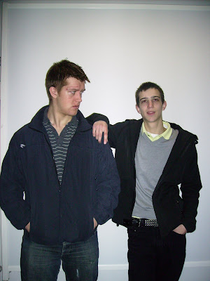
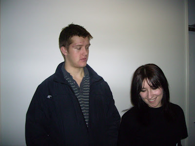
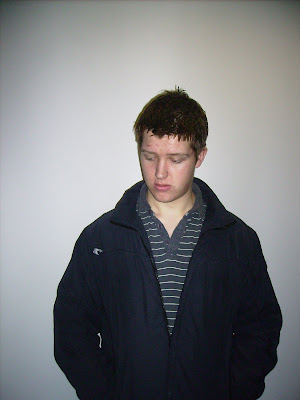
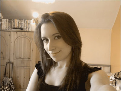
Other people's photography of our cast:


Other/Stock Images:
Screenshots from the trailer:
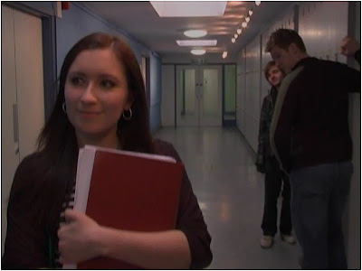
Poster 1:
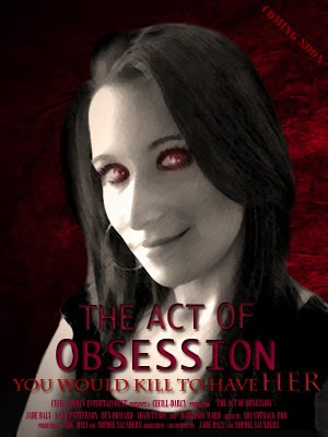
First we desaturated the image and used the magnetic lasso tool to cut around the face, so we could put it on a new background. After we pasted the image onto the new background, we cleaned up the edges with the rubber and opened the filters panel. We used the effect Smudge Stick with the colours set to black and white to get the slightly blurry sketchy effect. We then used the brush tool to make the eyes red, but added white brush stokes to give a more realistic effect on the eyes. On the main title, we added the Bevel and Emboss effect to make it stand out. We also added studio information below this to give a realistic effect.
Poster 2:
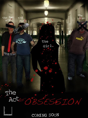
We used the burn tool to darken the shadows in the image, and the blur tool to make it fade slightly. The pictures of the cast were cut from their surroundings with the magnetic lasso, pasted onto the hallway background, and cleaned up with the rubber. Shadows were added to their feet and surroundings with the burn tool, and on the "Bad Boys" image, the legs were made to be full length with the clone stamp tool. To make the cast look more as if they were in the hallway, we blurred the edges very slightly and used the dodge and burn tools to create the lighting effects on their bodies. The bottom half of the poster fades to black with the burn tool. The pieces of tape were an I-stock image and were just pasted on. The graffiti type was written over the top of the text in a handwritten font. The blood splatter came from a brush downloaded from the Internet into photo shop. The text was typed one letter at a time so that we could rotate and move each letter to give it an uneven feel and to make some letters of the text look bolder, we copied that layer and moved it from the original slightly to give a bolder effect.
Magazine 1:
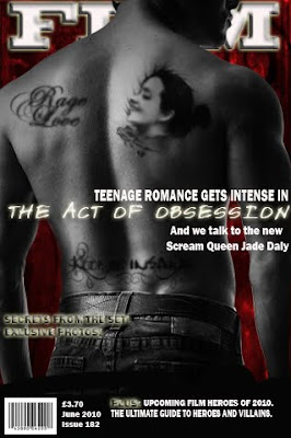
The background picture is similar to that of the poster of the girl, linking the two. We used the magnetic lasoo tool to paste the mans back image onto the red background, and the rubber tool to clean the edges. The two text "tattoo's" were brushes downloaded into photoshop, and were just lessened in opacity and blurred slightly to look like they were actually on the skin. The other "tattoo" was cut from a photograph and the edged were again, cleaned up with the rubber and blurred slightly. The image was desaturated and darkened with the burn tool to make the blacks blacker, and the dodge tool was used to lighten out the rest of the image. We changed the opacity and blurred the image again to make it look like it belonged on the skin, but it still looked like an image of a face paste don, so we used the smudge tool to pull a pattern out around the edges, we then used an image of a tatoo rose, which we put onto the image also, then blurred the image again. We then desaturated the image of the back, and used the dodge tool to darken the shadows. The text was placed behind the image and we used the effects, Bevel and Emboss, Inner Glow, outer glow, inner shadow and drop shadow. The rest of the text was unedited, apart from the film title, the "secrets from the set" text and the word "plus" which had the effect outer glow. We also pasted on a barcode, from the internet to give a realistic look.
Magazine 2:
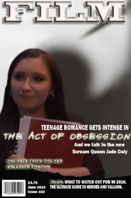
This poster had the same titles and backround as the first magazine cover, except that this one had a white background. The image was a screenshot from the trailer and we pasted it in and cleaned the edges. The image was very pixellated, so we tried to clear it up by editing the lighting with the burn and dodge tools, also using the smudge and blur tools to get rid of the very pixelated areas. The shadow image came from the background and we pasted it underneath the screenshotm, using the clone stamp tool to cover any areas that should have been part of the shadow but weren't, due to us rotating the image slightly.
When looking to make our ancillary tasks, we used several resources. These included:
Our own photography:


Other people's photography of our cast:


Other/Stock Images:


Screenshots from the trailer:

Poster 1:

First we desaturated the image and used the magnetic lasso tool to cut around the face, so we could put it on a new background. After we pasted the image onto the new background, we cleaned up the edges with the rubber and opened the filters panel. We used the effect Smudge Stick with the colours set to black and white to get the slightly blurry sketchy effect. We then used the brush tool to make the eyes red, but added white brush stokes to give a more realistic effect on the eyes. On the main title, we added the Bevel and Emboss effect to make it stand out. We also added studio information below this to give a realistic effect.
Poster 2:

We used the burn tool to darken the shadows in the image, and the blur tool to make it fade slightly. The pictures of the cast were cut from their surroundings with the magnetic lasso, pasted onto the hallway background, and cleaned up with the rubber. Shadows were added to their feet and surroundings with the burn tool, and on the "Bad Boys" image, the legs were made to be full length with the clone stamp tool. To make the cast look more as if they were in the hallway, we blurred the edges very slightly and used the dodge and burn tools to create the lighting effects on their bodies. The bottom half of the poster fades to black with the burn tool. The pieces of tape were an I-stock image and were just pasted on. The graffiti type was written over the top of the text in a handwritten font. The blood splatter came from a brush downloaded from the Internet into photo shop. The text was typed one letter at a time so that we could rotate and move each letter to give it an uneven feel and to make some letters of the text look bolder, we copied that layer and moved it from the original slightly to give a bolder effect.
Magazine 1:

The background picture is similar to that of the poster of the girl, linking the two. We used the magnetic lasoo tool to paste the mans back image onto the red background, and the rubber tool to clean the edges. The two text "tattoo's" were brushes downloaded into photoshop, and were just lessened in opacity and blurred slightly to look like they were actually on the skin. The other "tattoo" was cut from a photograph and the edged were again, cleaned up with the rubber and blurred slightly. The image was desaturated and darkened with the burn tool to make the blacks blacker, and the dodge tool was used to lighten out the rest of the image. We changed the opacity and blurred the image again to make it look like it belonged on the skin, but it still looked like an image of a face paste don, so we used the smudge tool to pull a pattern out around the edges, we then used an image of a tatoo rose, which we put onto the image also, then blurred the image again. We then desaturated the image of the back, and used the dodge tool to darken the shadows. The text was placed behind the image and we used the effects, Bevel and Emboss, Inner Glow, outer glow, inner shadow and drop shadow. The rest of the text was unedited, apart from the film title, the "secrets from the set" text and the word "plus" which had the effect outer glow. We also pasted on a barcode, from the internet to give a realistic look.
Magazine 2:
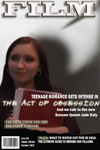
This poster had the same titles and backround as the first magazine cover, except that this one had a white background. The image was a screenshot from the trailer and we pasted it in and cleaned the edges. The image was very pixellated, so we tried to clear it up by editing the lighting with the burn and dodge tools, also using the smudge and blur tools to get rid of the very pixelated areas. The shadow image came from the background and we pasted it underneath the screenshotm, using the clone stamp tool to cover any areas that should have been part of the shadow but weren't, due to us rotating the image slightly.
Editing

We used the Final Cut editing software to edit our trailer. We also used the Soundtrack Pro software to get the backing music for our trailer, as well as the sound effects used, such as the wolves howling over the logo, the sharp "whoosh" noises, and the "hit" noise n the bathroom scene.
To create our film studio logo for our company, "Cecill-Darcy Entertainment", we used a 3-D text project and chose what we wanted to be our logo. We felt this gave our trailer a more professional look, as did the "wolf howling sound", our equivalent of the MGM logo.
On our first shot, in the hallway, the screen fades to black frequently and a heartbeat sound is heard over the void. To do this, we added a dip to colour, in this case black, at frequent intervals. We placed single heartbeat sounds, from Soundtrack Pro at these intervals, and slowed the speed of the sound, also adding the gain to +7. We used a backing track on this shot also, which we also slowed down to 95. We slowed the whole shot down to fit in with the sounds and added cross fades to the dip to colours so that they faded more gently.
We used the "Bad Film" effect on allot of our shots. When we used "Bad Film", we left the shots focused, but added scratches, dust, seed, allot of mix, saturation and jitter. We didn't use any hairs, and had no frequency of change. We felt the shaky, almost desaturated look added a horror element and helped the shots look bleaker and scarier.
In some scenes, we also used a vignette. We felt that this added a darkness to the shots that wasn't immediately defined as a vignette as the shots we used them on were very brief and we changed the settings so they weren't as noticeable. We set the mix to 100% and the saturation, size, falloff and darken to 50%.
In our "picture" shots, we captured stills (freeze frames) of our scenes and coloured them to sepia in the video filters and image control option, adding the camera sound over the top. Wee felt this made the trailer look very voyeuristic, which fit with our storyline, and was a good way to convey the obsession.
In the "Captured" scene where we see a victim bound, we used dip to colours again, but made them dark red in this shot to signify the danger.
We edited allot of our sounds also, changing the speed in some and adding pitch reverberation and gain, to make them sound slower, lower and generally scarier.
Monday 12 April 2010
Other Marketing Techniques
When marketing a film , trailers and posters are not the only way of getting your film 'out there'. Obviously as our trailer is not for a real film we cannot actually market it but if we could these are some of the options we could consider.
Merchandise - plays a big role in the marketing of films. For example we could sell t shirts, mugs, and hats all bearing the films tag line 'you'd kill to have her'.
Media Advertising - posters do not only appear in the cinema. We could also have posters in bus stops and on the sides of double Decker buses. Smaller posters could appear inside magazine or even fill a whole page in a magazine. We could also play a shorter version of our trailer on the television, which also allows us to target the right audience depending on which programmes it would play between.
Premiers - Most films have premiers which creates hype about the film. In most cases the press will be there to run the story of the 'new big hit' allowing more advertisement for the film.
Festivals - Festivals allows large crowds of people who may not usually see your film to experience it. Festivals are really helpful for low budget films that find marketing there film difficult. It also allows opportunities for winning awards for your work.
Word Of Mouth - This is uncontrollable but it can work out really well. It simply means people discussing your film/trailer/poster, and hopefully recommending it to other people allowing a wider audience for the film.


Magazines
We can see from the magazine covers, that no matter what the genre the main character for the chosen film is the USP for the magazine. They are the only image, and they are eye catching.


Our Poster

Our posters Unique Selling Point (USP) was the main character (Claire). This worked well as the target audience being boys and girls aged 15-25 can relate. The girls want to be her. The boys want her. So it made sense to have her as the main draw to the film. The poster doesn't give away to much of the story - keeping people intrigued. We used reds and pinks to denote danger temptation and the femininity that comes with the character. Obviously the reds work well for the horror genre as it signifies blood as well. The colours are also striking. Obviously posters are static unlike the actual trailer or film so they have to be eye catching. People do not tend to stop and study a poster, so you only have a few seconds to make an impression.

This poster was more of a teaser poster. We used a technique similar to the marketing campaign for the recent Batman film, "The Dark Knight", where at first, teaser posters giving clues about the storyline were shown, then when the trailer and other marketing techniques were issued, other posters were put out, these ones based on sole characters, like our poster above. We "graffitied" the poster, adding words and letters to the boys "names" and putting "tape" over their faces, also, showing the girl as a silhouette. This way, we don't know who any of the characters are right away, and giving the audience some intrigue so they are more interested in the other poster/s and trailer when they come out. The graffiti aspect also gives a teenage feel, hopefully connecting more with our target audience.
Target Audience
Our target audience is generally both Males and Females around 15 to 25. We aimed our trailer/ film towards a younger age group as we thought they were more likely to go to the cinema and to actually see a horror film. Horror films released recently (or coming soon) have used 'stars' that can be associated with and attract a younger audience. For example Jennifer's Body starred Megan Fox and Kyle Gallner-who also starred in The Haunting In Connecticut. The remake of Nightmare On Elm Street also stars Kyle Gallner and Kellan Luts-who stars in the twilight saga; a teen favorite. As the film we wanted to make was a similar to the films mentioned, we felt it best to target the right people.
Obviously we could not have real stars in our trailer but we chose to use a younger cast- allowing the audience to connect with the trailer, therefore increasing the chance that they will see the full length film later on. We also based our idea within a 'high school' again forming a bridge between the audience and the film.
We passed out some questionnaires to find out what our audience expected to see within a trailer- not just horror trailers, just trailers in general to help us put together an idea of what it was we wanted to produce.
Trailers-Questionnaire 1
Is there anything in particular that would catch your attention when watching a good trailer?
I need a strong idea to catch my attention in the first few seconds... you know how it is when you meet someone new, you kind of make up your mind about them with the first hand shake!
Where would you be most likely to see a film trailer? For example in the cinema, online and so on.
At the moment it is probably a bit of everything, but in order: on-line (my computer opens on the Apple homepage which has a good trailer section) followed by cinema, DVD, and TV.
How long would you expect a typical trailer to last?
I think it has to do the business in about a minute, as I don't want to learn too much about the film, just enough to draw me in. Want all the twists in the plot to be a surprise, so please don't feed me a summary of the film as some do, which answers
How much of a films storyline would you expect to see in a trailer?
N/A
What do you expect to see when watching the trailer for a new ‘horror’ film?
probably somebody scared... but what is the cause?
Trailers - Questionnaire 2
Is there anything in particular that would catch your attention when watching a good trailer?
Quite a difficult question to identify what makes a good trailer – but I expect that anything especially funny, exciting or noteworthy would catch my attention.
Where would you be most likely to see a film trailer? For example in the cinema, online and so on.
My job is to programme a small cinema so I often look online at trailers. If this was not my job, I expect that if I was making a decision about what to go and see and had online access, I would take a look at trailers as well synopses. The other location where I am most likely to see a film trailer is at the cinema.
How long would you expect a typical trailer to last?
2 minutes 30 seconds max
How much of a films storyline would you expect to see in a trailer?
I would expect the trailer to tell the story of the film in abbreviated form, in a 3 act structure similar to a feature length film, but without giving away the ending or including any ‘spoilers’.
What do you expect to see when watching the trailer for a new ‘horror’ film?
Indication of what will cause horror / terror to audience and strong sense of menace. Obviously this film genre incorporates a number of sub-genres and repeated themes such as vampire themes, slasher themes, zombie themes, demonic possession, evil children, haunted houses, cannibalism etc.
Once our trailer was complete we uploaded it to youtube ;
We then posted the link to facebook, twitter and other social networking sites in order for a wide range of people to watch our trailer. We left it for a couple of months so we could see who had been watching our film over a period of time.

This let us see which link our audience had followed, which was help full as we can determine which site/link worked out better for marketing. We can see from the list that facebook was the popular. We also know that the age group for facebook is quite young.

From this image we can see the age bracket that has been watching our trailer. We can see that the majority of our audience is female, and that the largest age bracket is 18-24. With Some people watching aged 13-17 and the smallest group being age 25-34. This was really useful as it reinforces the fact that we are hitting our target audience.
Saturday 10 April 2010


Subscribe to:
Posts (Atom)