When looking to make our ancillary tasks, we used several resources. These included:
Our own photography:


Other people's photography of our cast:


Other/Stock Images:


Screenshots from the trailer:

Poster 1:

First we desaturated the image and used the magnetic lasso tool to cut around the face, so we could put it on a new background. After we pasted the image onto the new background, we cleaned up the edges with the rubber and opened the filters panel. We used the effect Smudge Stick with the colours set to black and white to get the slightly blurry sketchy effect. We then used the brush tool to make the eyes red, but added white brush stokes to give a more realistic effect on the eyes. On the main title, we added the Bevel and Emboss effect to make it stand out. We also added studio information below this to give a realistic effect.
Poster 2:

We used the burn tool to darken the shadows in the image, and the blur tool to make it fade slightly. The pictures of the cast were cut from their surroundings with the magnetic lasso, pasted onto the hallway background, and cleaned up with the rubber. Shadows were added to their feet and surroundings with the burn tool, and on the "Bad Boys" image, the legs were made to be full length with the clone stamp tool. To make the cast look more as if they were in the hallway, we blurred the edges very slightly and used the dodge and burn tools to create the lighting effects on their bodies. The bottom half of the poster fades to black with the burn tool. The pieces of tape were an I-stock image and were just pasted on. The graffiti type was written over the top of the text in a handwritten font. The blood splatter came from a brush downloaded from the Internet into photo shop. The text was typed one letter at a time so that we could rotate and move each letter to give it an uneven feel and to make some letters of the text look bolder, we copied that layer and moved it from the original slightly to give a bolder effect.
Magazine 1:

The background picture is similar to that of the poster of the girl, linking the two. We used the magnetic lasoo tool to paste the mans back image onto the red background, and the rubber tool to clean the edges. The two text "tattoo's" were brushes downloaded into photoshop, and were just lessened in opacity and blurred slightly to look like they were actually on the skin. The other "tattoo" was cut from a photograph and the edged were again, cleaned up with the rubber and blurred slightly. The image was desaturated and darkened with the burn tool to make the blacks blacker, and the dodge tool was used to lighten out the rest of the image. We changed the opacity and blurred the image again to make it look like it belonged on the skin, but it still looked like an image of a face paste don, so we used the smudge tool to pull a pattern out around the edges, we then used an image of a tatoo rose, which we put onto the image also, then blurred the image again. We then desaturated the image of the back, and used the dodge tool to darken the shadows. The text was placed behind the image and we used the effects, Bevel and Emboss, Inner Glow, outer glow, inner shadow and drop shadow. The rest of the text was unedited, apart from the film title, the "secrets from the set" text and the word "plus" which had the effect outer glow. We also pasted on a barcode, from the internet to give a realistic look.
Magazine 2:
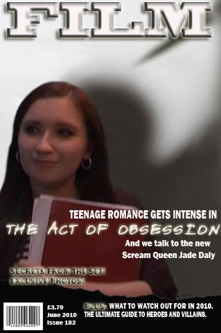
This poster had the same titles and backround as the first magazine cover, except that this one had a white background. The image was a screenshot from the trailer and we pasted it in and cleaned the edges. The image was very pixellated, so we tried to clear it up by editing the lighting with the burn and dodge tools, also using the smudge and blur tools to get rid of the very pixelated areas. The shadow image came from the background and we pasted it underneath the screenshotm, using the clone stamp tool to cover any areas that should have been part of the shadow but weren't, due to us rotating the image slightly.
No comments:
Post a Comment